15 Stunning Living Room Color Schemes for Every Style
Choosing the right color scheme for your living room is more than a design decision—it’s an invitation. The right mix of hues can completely shift the mood, energy, and personality of your space.
From earthy neutrals to bold, unexpected pairings, today’s color palettes are about creating harmony with contrast and expressing personal style. A well-curated scheme doesn’t just look beautiful—it feels just right.
Whether you’re dreaming of a cozy retreat or a vibrant gathering space, these 15 handpicked living room color combinations offer inspiring ways to refresh and elevate your home.
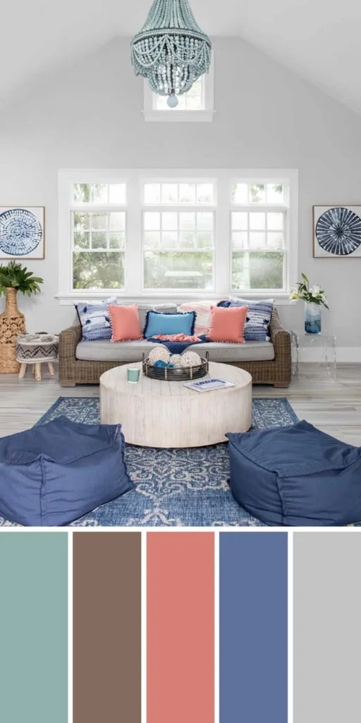
1. Bring Vibrancy with Bright and Neutral Colors
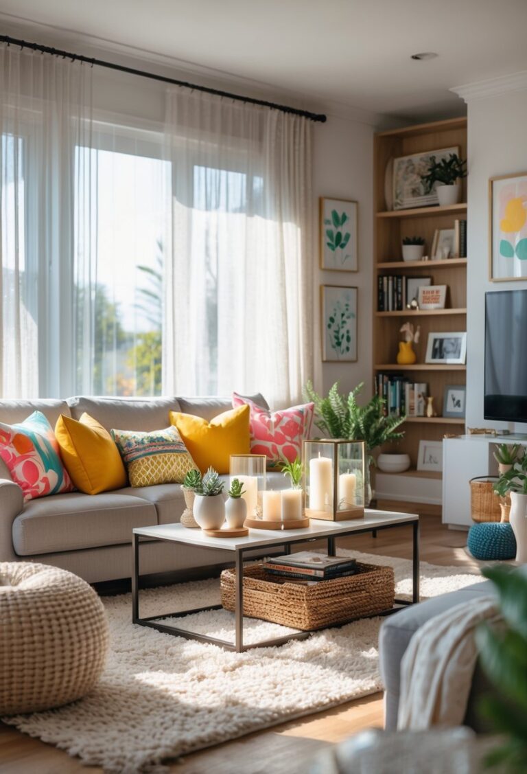
Combining bright and neutral colors in your living room creates a lively yet balanced atmosphere that appeals to both modern and playful sensibilities. Vibrant tones like turquoise or coral inject personality, while neutrals such as beige or soft gray offer a grounding effect. This interplay allows you to experiment with bold accent pieces without overwhelming the space.
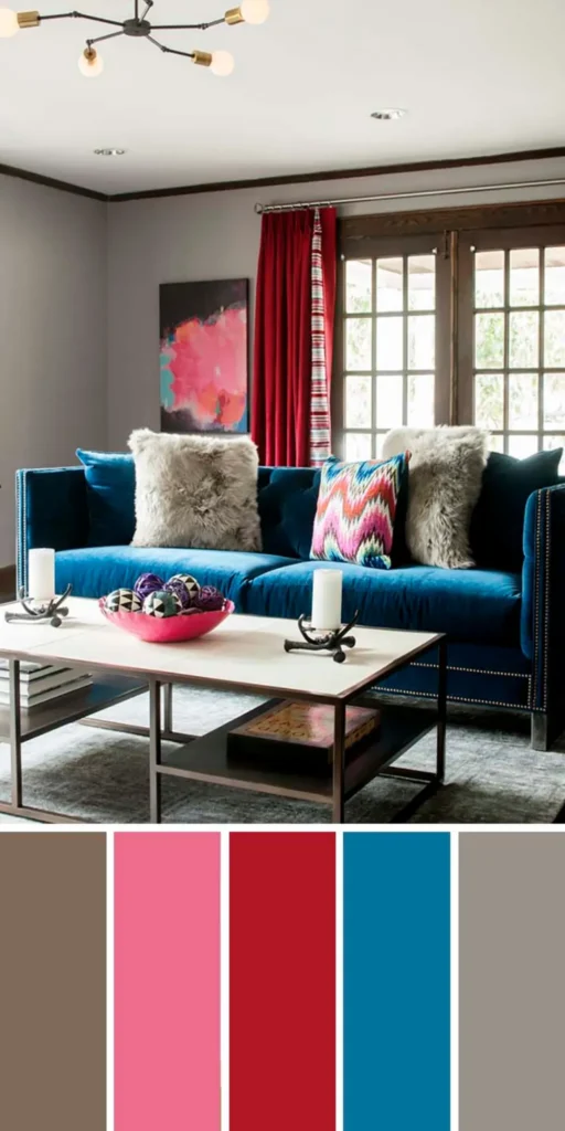
To achieve harmony, anchor the room with neutral walls or large furnishings, then layer in bright elements through throw pillows, artwork, or rugs. The contrast not only draws attention to focal points but also adds depth and character. This dynamic blend makes the room feel energetic, inviting, and thoughtfully curated.
2. Olive Green + Cream + Black
Olive green brings a grounded, earthy feel that mirrors the calmness of nature, while cream softens the room with its subtle warmth. Together, they create a serene and balanced foundation for any space.
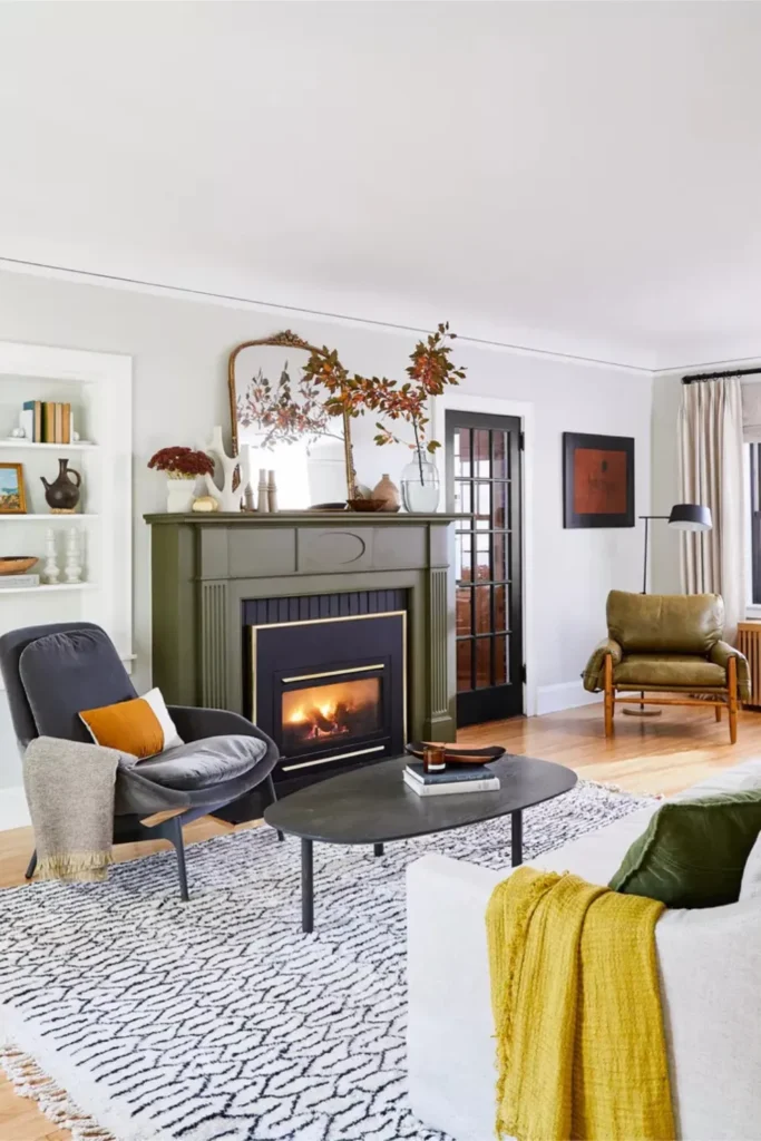
The addition of black accents introduces sophistication and contrast, helping anchor the lighter tones. Whether used in furniture, trim, or décor, black sharpens the overall aesthetic without overpowering the room’s natural harmony.
3. Warm-Cool Calm: Chic Brown, Blue and White
Chic brown tones introduce warmth and grounding, effortlessly complementing clean white walls that reflect light and openness. Together, they create a welcoming foundation that feels cozy yet refined, ideal for both modern and traditional spaces.
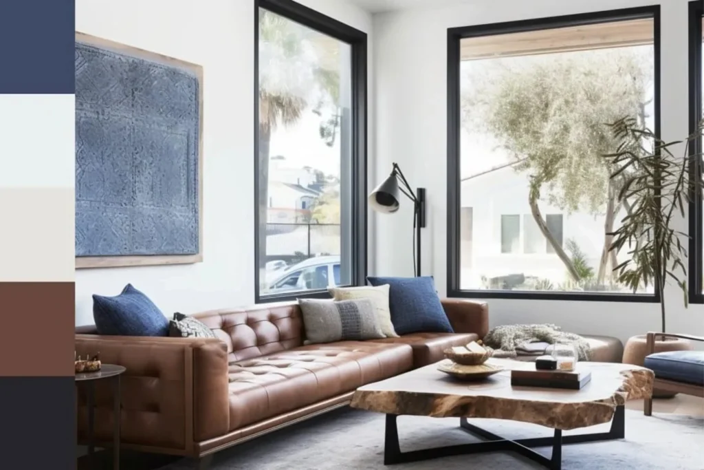
Adding cobalt or deep blue accents infuses the room with a refreshing coolness, balancing the warmth of the browns. This thoughtful mix of contrast and calm results in a serene living area with layered depth and quiet sophistication.
4. Yellow-Green, Navy, and Cream
Yellow-green brings a burst of freshness to the living room, infusing the space with a natural vibrancy that feels both energetic and welcoming. Paired with deep navy, the bold contrast creates visual interest without overwhelming the room’s calm atmosphere.
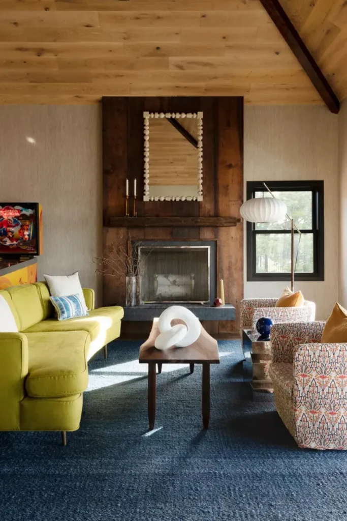
Cream accents tie the palette together, softening the strong hues and adding a layer of understated elegance. This combination strikes a perfect balance—earthy yet sophisticated—making it ideal for cozy evenings, casual gatherings, or simply elevating your everyday living space with timeless charm.
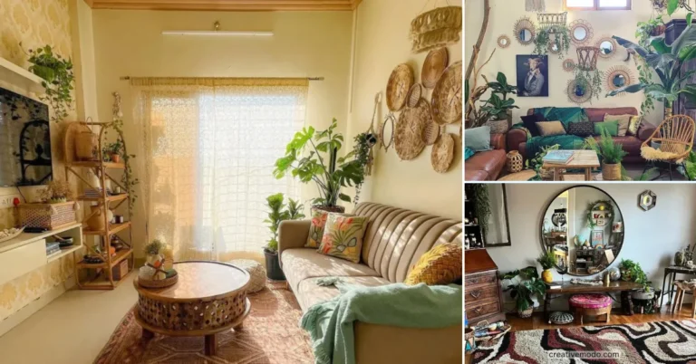
5. Create a Fairy Tale Wonderland with a Living Room Palette
Transform your living room into a whimsical retreat by embracing soft, dreamy hues that evoke a sense of magic and charm. Pastel pinks, gentle blues, and creamy whites create an ethereal atmosphere that feels like stepping into a fairy tale.
Layering delicate textures, floral patterns, and antique-inspired accents enhances the romantic feel, making the space warm, inviting, and full of personality. This palette isn’t just about color—it’s about storytelling, offering a daily escape into beauty, wonder, and imagination right in the heart of your home.
6. Tangerine + Cornflower + Shades of White
A living room styled with tangerine and cornflower blue creates an energizing yet balanced ambiance. The vibrant orange adds cheerful warmth, while the soft blue tones calm the space, making it feel playful without overwhelming the senses.
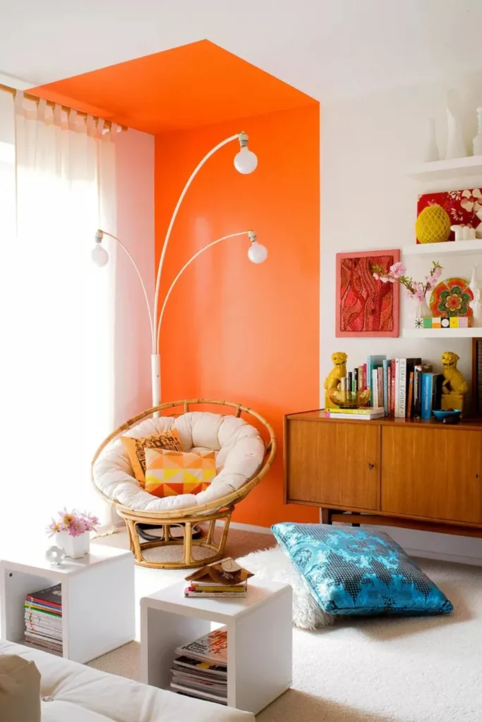
Shades of white act as the perfect backdrop, softening the contrast and allowing the bold colors to shine. By incorporating this palette through accent walls, cushions, or art, you can achieve a fresh, dynamic interior that feels both uplifting and inviting.
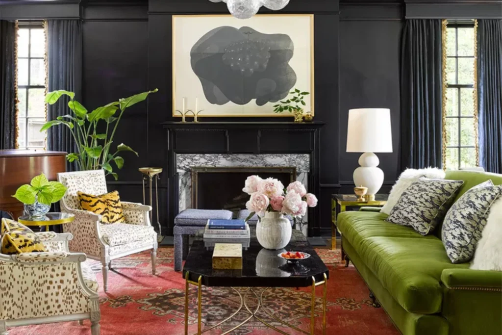
7. Painter’s Harmony in Hues: Black, White and Gold
A black, white, and gold color scheme brings painterly sophistication to any living room, echoing the bold strokes and contrasts of contemporary artwork. Black offers grounding depth, white provides clarity, and gold adds warmth and luxurious shimmer.
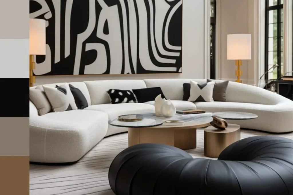
This trio works best when layered thoughtfully—black accents on furniture or frames, white on walls or textiles, and gold in lighting or decor details. The result is a space that feels curated and expressive, blending dramatic flair with timeless elegance in a truly artistic way.
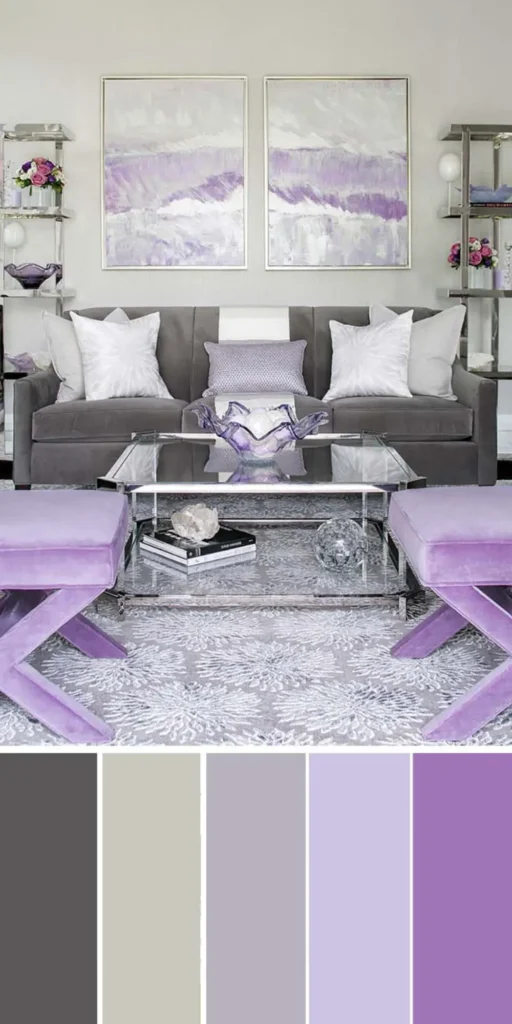
8. Soft Grays and Natural Wood Tones
Soft grays paired with natural wood tones create an atmosphere of calm sophistication, ideal for a living room that feels both grounded and serene. The cool neutrality of gray complements the organic warmth of wood, balancing modernity with comfort.
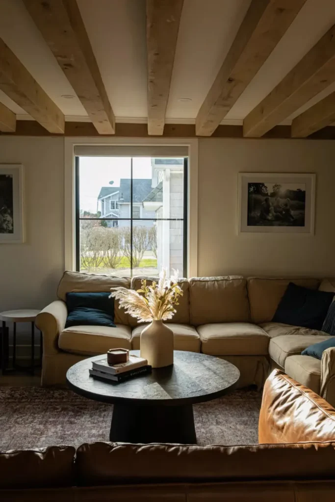
This pairing invites a layered aesthetic—think gray textiles, stone accents, and warm timber furniture that echo the beauty of natural elements. It’s a subtle yet timeless palette that evokes simplicity without feeling sparse, perfect for spaces that embrace a relaxed, nature-inspired charm.
9. Find the Perfect Balance with Soft Earthy Colors
Soft earthy colors bring a sense of harmony and quiet strength to a living room, blending natural tones like muted clay, sandy beige, and warm taupe. These shades ground the space while promoting a relaxed, welcoming atmosphere.
When layered thoughtfully with textured fabrics and natural materials, these colors evoke the beauty of untouched landscapes. They pair effortlessly with wood accents, soft lighting, and botanical elements, creating a balanced aesthetic that feels both modern and timeless.
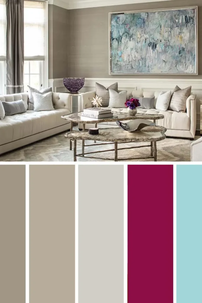
10. Citron Green + Dusty Rose + Charcoal
Citron green, dusty rose, and charcoal form a refreshing yet grounded palette that strikes a perfect balance between playful and sophisticated. The lively energy of citron is beautifully tempered by the softness of rose and the depth of charcoal.
This trio works well in modern or eclectic interiors, offering just enough contrast to feel dynamic without overwhelming the space. Layering these hues with clean lines, plush textures, and natural lighting adds dimension and warmth to a thoughtfully curated living room.
11. Autumnal Aura: Rich Warm Tones and Off-White
An autumnal-inspired palette of rich warm tones paired with soft off-white instantly brings comfort and charm into a space. Think deep reds, golden browns, and burnt oranges layered against creamy neutrals for a cozy yet refined atmosphere.
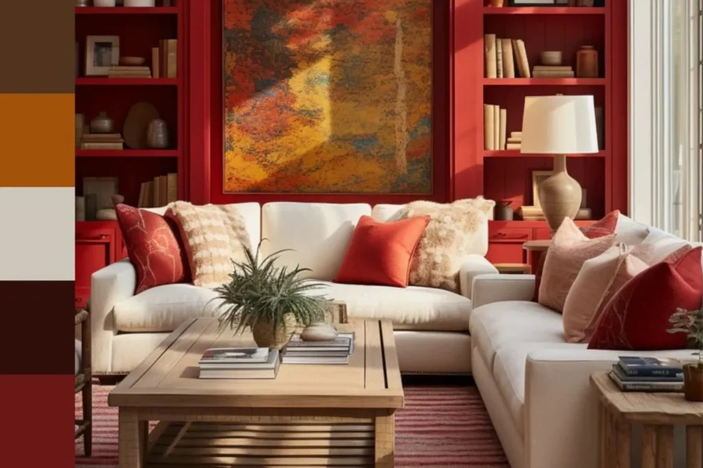
This color scheme evokes the essence of fall without feeling seasonal or limited. The off-white base keeps the warmth balanced, allowing earthy tones to shine through textiles, art, or accent furniture while maintaining a bright and inviting living room feel.
12. Pinks, Peaches, and Warm Hues
Pinks, peaches, and warm hues create a radiant living room atmosphere that feels both modern and nostalgic. These tones add a soft glow to the space, enhancing natural light and wrapping the room in gentle warmth and charm.
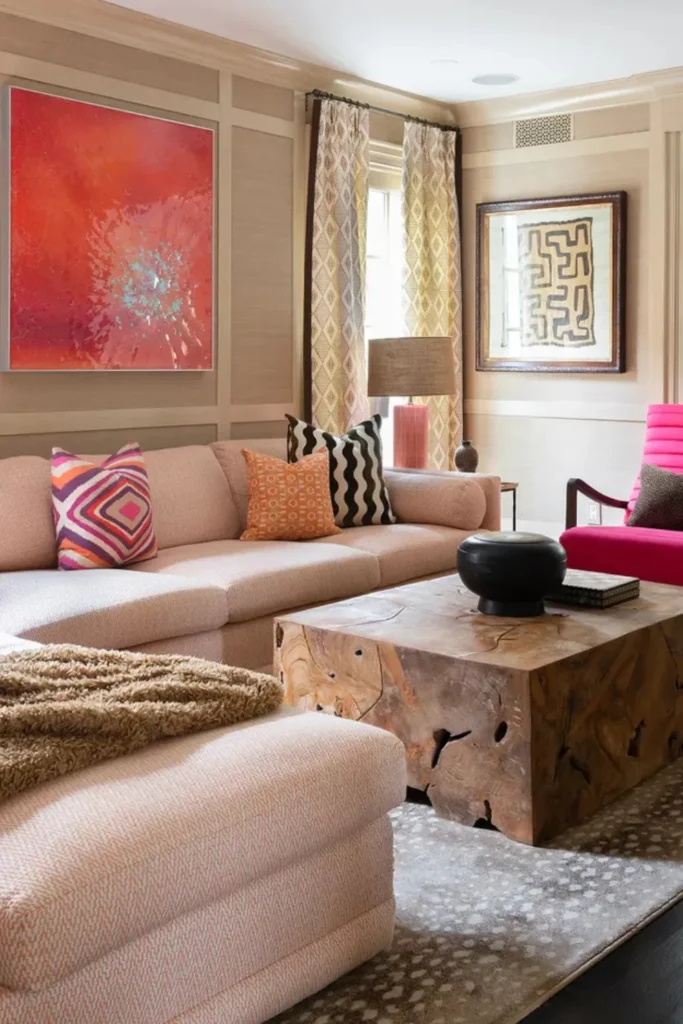
Layering blush, coral, and warm neutrals with rich wood accents or golden touches elevates the look while keeping it grounded. This combination works beautifully across design styles, offering a lively yet soothing palette that feels inviting and effortlessly stylish.
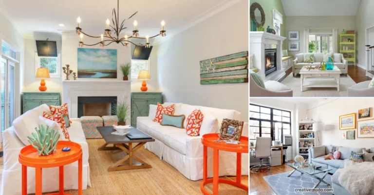
13. Make a Bold Statement with Coastal Colors
Coastal colors aren’t just for beach houses—they can bring fresh energy and personality to any living room. Bold shades of blue, soft sandy neutrals, and crisp whites work together to create a breezy, confident atmosphere.
To make an unforgettable statement, pair navy or turquoise accents with light wood finishes and textured fabrics. This palette evokes seaside serenity while maintaining a polished, modern edge that feels as vibrant as it is calming.
14. Nature’s Equilibrium: Vibrant Green and Terracotta
Vibrant green and terracotta create a living room palette that feels grounded yet alive. The rich green tones mirror the lushness of nature, while warm terracotta brings in the earthy calm of sun-drenched clay and rustic landscapes.
This color scheme offers more than beauty—it provides balance. Green energizes the space, and terracotta warms it, forming a perfect harmony. Add creamy neutrals and organic textures to enhance the natural flow and make your room feel both cozy and revitalized.
15. Caramel With Taupe Accents
Caramel tones bring an inviting warmth to any living room, effortlessly creating a cozy and elegant atmosphere. When paired with soft taupe accents, the palette feels layered and refined, offering a timeless yet modern visual balance.
This combination is ideal for those who appreciate subtle sophistication. Taupe’s muted charm gently cools down caramel’s richness, allowing for added texture and depth through natural wood, soft textiles, or brushed metallics without overwhelming the space.
To elevate your interior, explore these beautiful:
Frequently Asked Question
What colors work well with caramel in a living room?
Taupe, cream, and warm neutrals pair beautifully with caramel.
Is caramel a warm or cool tone?
Caramel is a warm tone.
What mood does a caramel and taupe palette create?
It creates a cozy, elegant, and inviting mood.
Conclusion
A thoughtful living room color scheme goes beyond aesthetics—it sets the tone for comfort, style, and personality. From earthy neutrals to vibrant contrasts, each palette creates a mood that transforms how a space feels. Whether it’s the calm of soft grays or the bold energy of citron green, color has the power to reflect your lifestyle and elevate your home. When chosen intentionally, it becomes more than design—it becomes a statement of how you live.